Visualizing Slavery
 A recent New York Times op-ed highlighting a map from 1860 caught my eye. It is apparently the last census map that visually mapped slavery in terms of spatial concentration. While the article itself says little about environment or ecology, as many have argued (see, for example,Carolyn Merchant’s The Columbia Guide to Environmental History (2002) Ch3 “The Tobacco and Cotton South”; 39-57) American slavery was very much an outcome of cultural and natural factors.
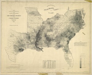
In fact, the map can serve as a nice visual supplement to show how slavery’s concentrations were in areas of prime agrarian promise. For example, strong concentrations of slaves (indicated by darker shades) along the Mississippi river highlight the fertile floodplains of the river and their potential of continued cultivation. The pop-up windows can also serve as a useful tool to get students conversing about how demographics might have shifted as intense cultivation depleted soil and plantations moved westwards.